Create a Landing page
Landing Pages are extremely powerful and flexible pages. Landing pages should be used when you need to:
- Control page layout
- Pull in information from elsewhere on the site
NOTE: Because of it's flexibility, Landing Pages are more time-consuming to create than Basic Pages. If you do not need to above functionality, we recommend using the Basic Page template.
From the top navigation menu, click on Shortcuts > Add Content.

From the Add Content menu, choose Landing Page.
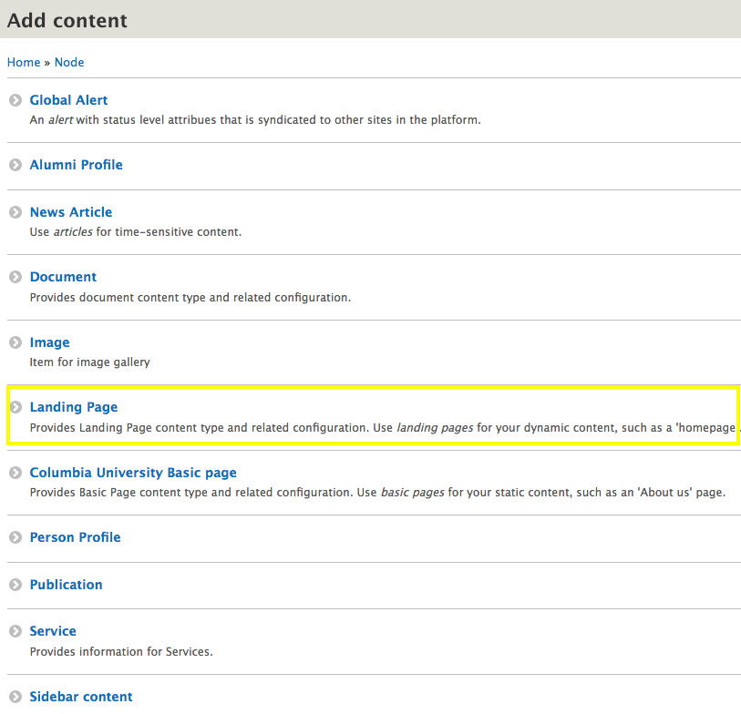
Select the type of landing page to create. NOTE: This example goes through Create New.

- Create New allows you to set up your Landing Page from scratch
- The other options - Homepage, Documents, Events, News, Services, and Staff Directory - create a duplicate of the selected landing page which originally "shipped" with your site.
- Use this if you accidentally deleted one of these landing pages and need to re-create
- Once created you can edit the page as needed
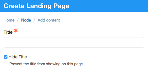
Add the page title.
Start building out the Landing Page Content.
Many options in this dropdown are found on other page templates:
- accordion
- icon cards
- image cards
- image carousel
- inline image
- mailchimp embed
- map location
- numbered paragraph
- pull quote
- related block
- single image
- soundcloud
- table
- text
- video
- webform
Several options in this dropdown are unique to Landing Pages:
- page section
- dual tabbed paragraph
- hero
- hero Carousel
- image card carousel
- super hero
- tabbed content
- third-party RSS Feeds
- timeline
- Views display

If needed, revise the Publish, UNI access and Social Share settings
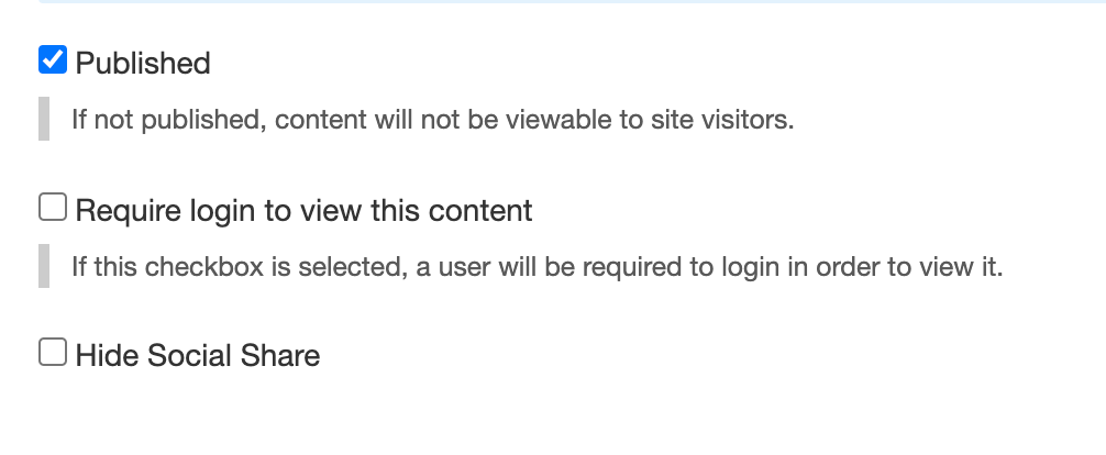
There are three checkboxes at the bottom of the page:
- Publish (checked by default)
- If left unchecked, the page will not be accessible to anyone not logged into the site. You can always locate this page in the Content Library and check the box to make it publicly available.
- If left unchecked, the page will not be accessible to anyone not logged into the site. You can always locate this page in the Content Library and check the box to make it publicly available.
- Require login to view this content
- If checked, this page will require UNI log in for users to access the content. Anyone with a UNI will be able to access this page once verified.
- If checked, this page will require UNI log in for users to access the content. Anyone with a UNI will be able to access this page once verified.
- Hide Social Share
- If checked, the Social Share buttons will not display on the page

- Publish (checked by default)
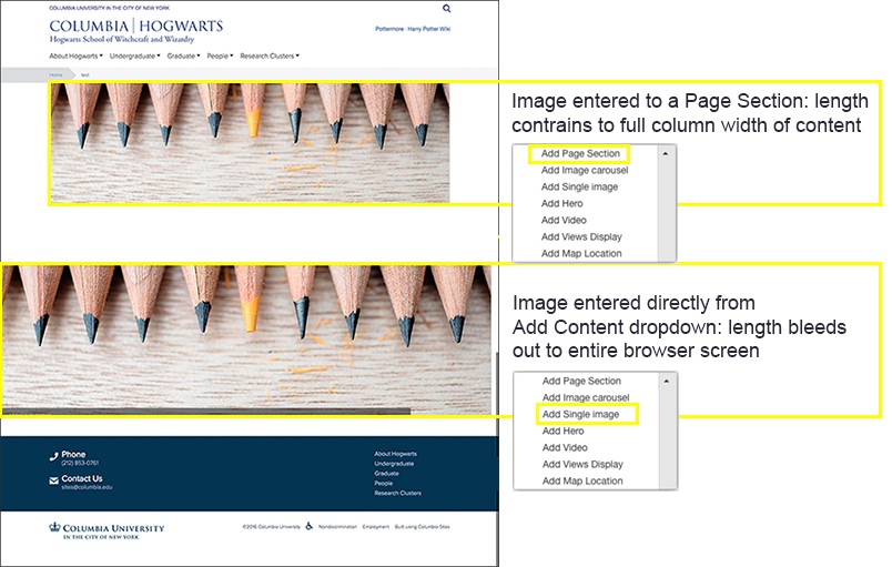
Understanding Page Sections
Page Sections are exclusive to Landing Pages and impact the margins of the content within the page. Content added outside of a Page Section spans the entire width of the screen, extending beyond the page boundaries.
Content types only available OUTSIDE a page section
Some content types can only be added outside a page section, meaning they must display the full width of the page. They are:
Content types only available INSIDE a page section
Some content types can only be added inside a page section, meaning their width can be set using grid widths. They are:
- accordion
- Dual tabbed paragraph
- image cards
- inline image
- links with label
- list with label
- numbered paragraph
- pull quote
- table
- text
- text with label