Grid Widths
Grid widths enable flexible and responsive content layouts on Landing Pages.
Definition
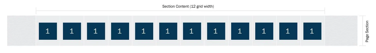
In Columbia Sites, the layout of content on Landing Pages is structured using a 12-unit grid system. Each content element can span from 1 to 12 grid units, allowing for flexible and responsive design configurations.
By effectively utilizing grid widths, you can create structured, responsive, and visually appealing layouts on your Columbia Sites Landing Pages.
Usage & Specification
When to Use:
Grid widths are applied when:
-
Creating Section Content blocks.
-
Adding Image Cards or Info Cards.
-
Tiling Social Media Embeds horizontally across a page.
Specifications:
-
The full width of a page is divided into 12 equal grid units.
-
Content can span any number of these units, from 1 (narrowest) to 12 (full width).
-
Grid widths determine how content is arranged and how much horizontal space each element occupies.
Section Content Grid Widths
Each Section Content block must have an assigned grid width. This setting dictates the horizontal space the section occupies.
Example:
-
Two Section Content blocks are added:
-
First block: 8 grid units.
-
Second block: 4 grid units.
-
These two blocks will sit side by side, collectively occupying the full 12-unit width of the page.
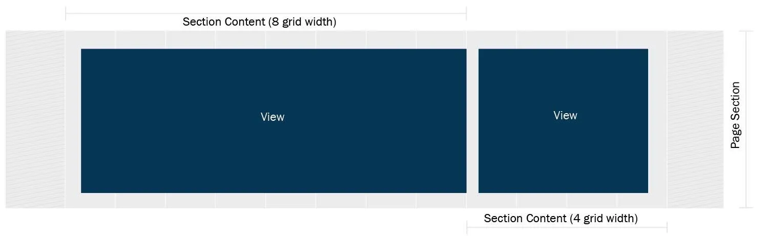
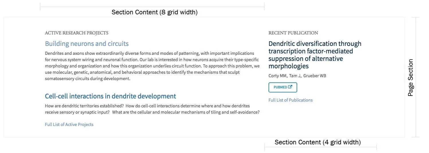
Image and Icon Card Grid Widths
When adding Image Cards or Icon Cards, grid widths are set for both the overall card group and individual cards:
-
Card Group Grid Width: Determines the total width available for the group of cards.
-
Individual Card Width: Specifies how many grid units each card occupies within the group.
Examples
-
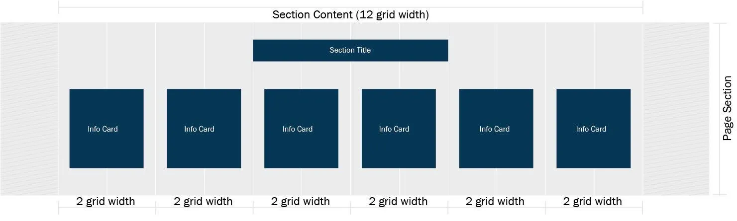
6 Icon Cards in a Full-Width Section:
-
Section Content: 12 grid units.
-
Each Info Card: 2 grid units.
-
Result: 6 cards display in a single row.
-
-
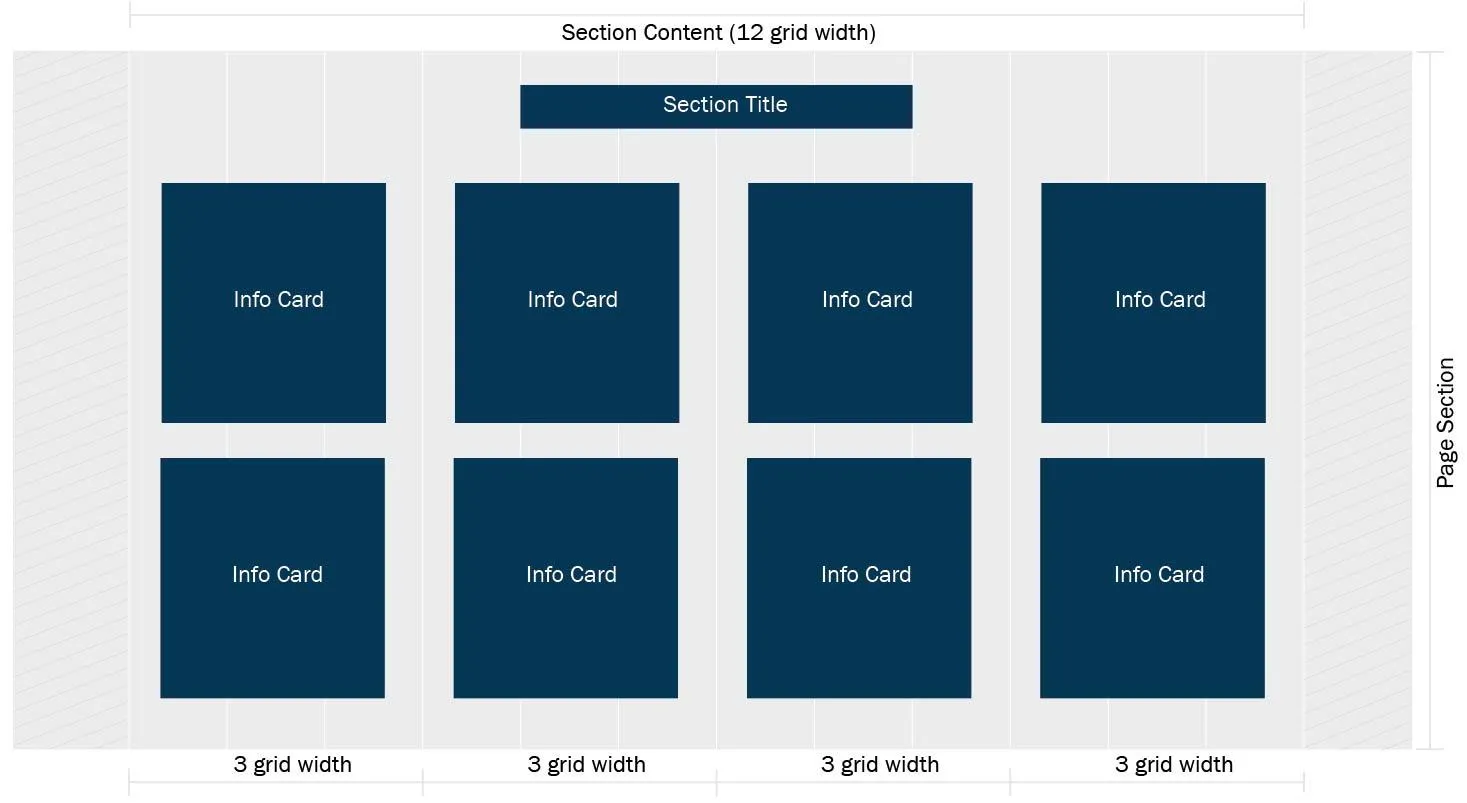
8 Icon Cards in a Full-Width Section:
-
Section Content: 12 grid units.
-
Each Info Card: 3 grid units.
-
Result: 4 cards per row; cards wrap to the next line.
-
-
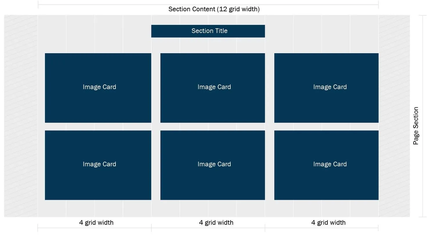
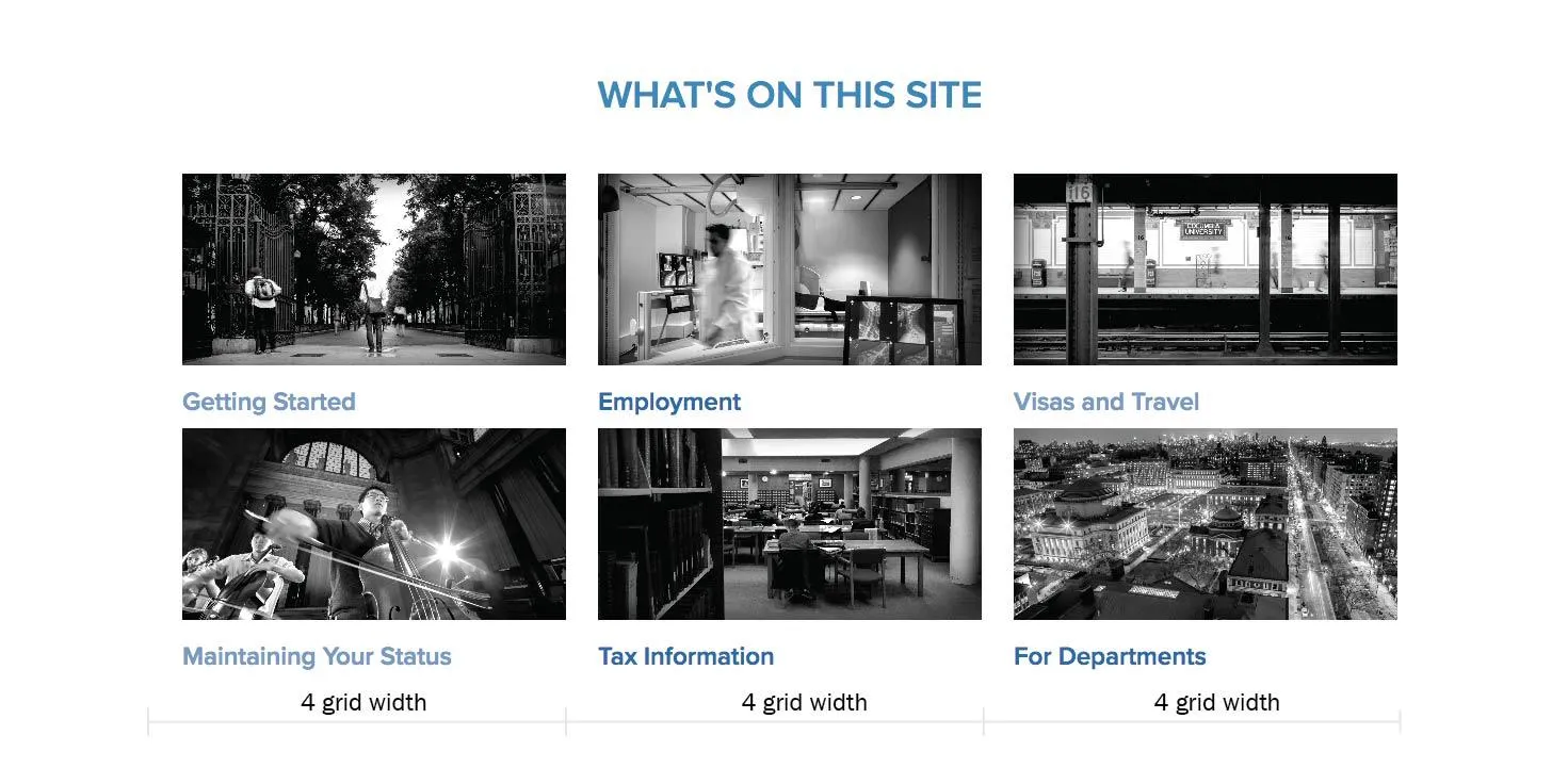
6 Image Cards in a Full-Width Section:
-
Section Content: 12 grid units.
-
Each Image Card: 4 grid units.
-
Result: 3 cards per row; cards wrap to the next line.
-
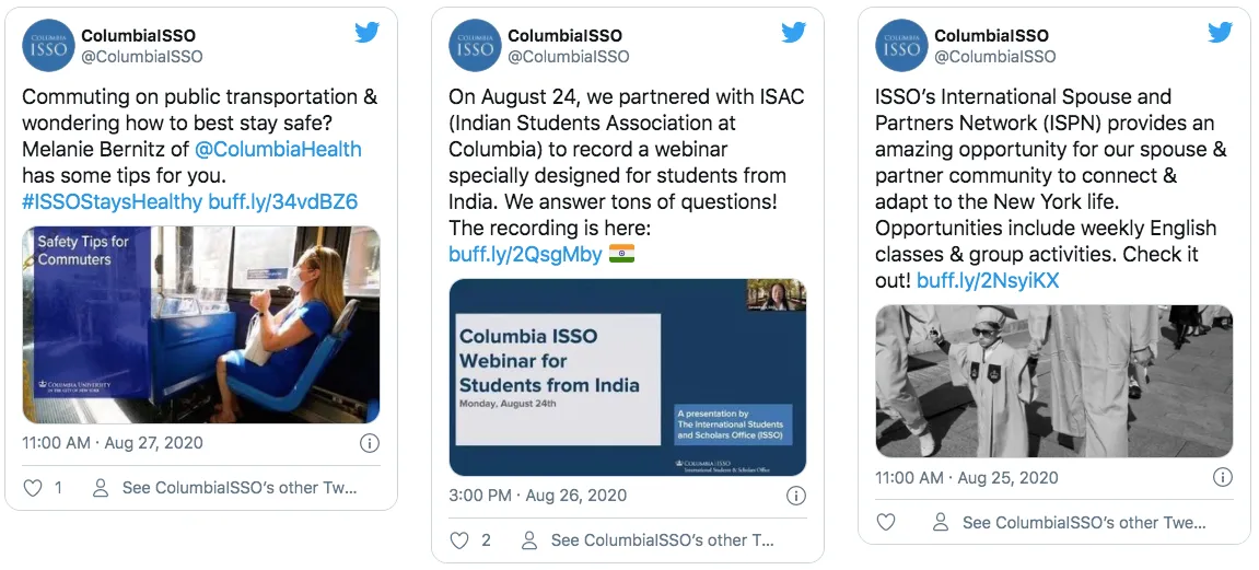
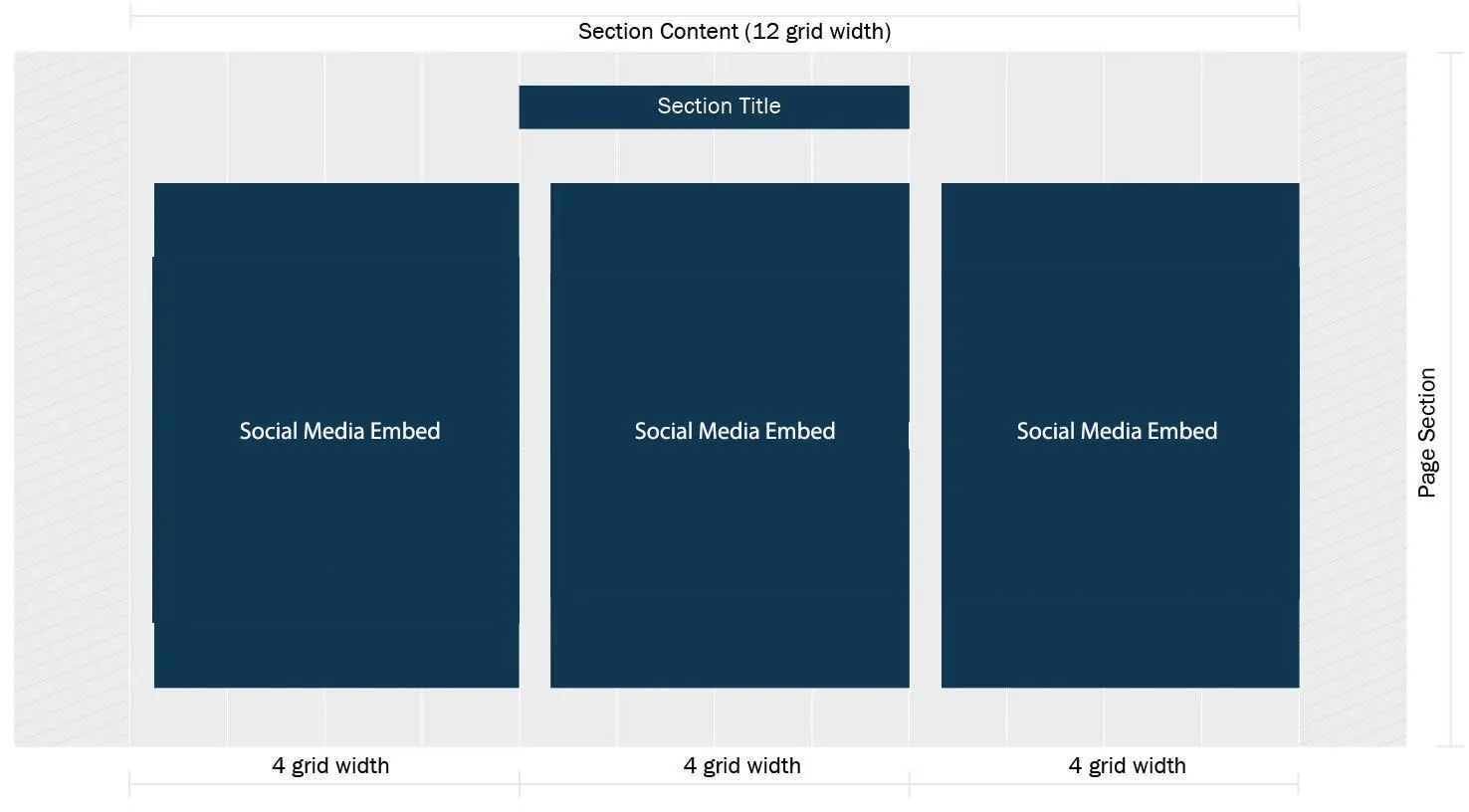
Tiling Social Media Embeds Horizontally
To display multiple social media embeds side by side:
-
Create multiple Section Content blocks within the same page section.
-
Assign each block a grid width (e.g., 4 units).
-
Add a social media embed to each block.
-
Ensure the combined grid widths equal 12 for a full-width row.
Example:
-
Three Section Content blocks, each with 4 grid units.
-
Each contains a social media embed.
-
Result: Three embeds displayed horizontally across the page.
What the content entry looks like on the backend:
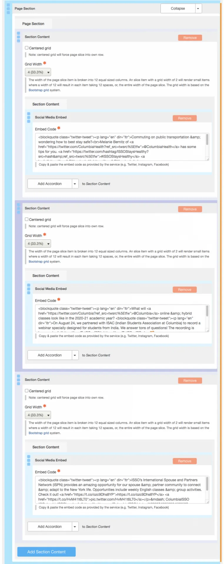
When the Social Media Embed code is added to each section content the following layout renders: