Image Cards Carousel
Image Cards Carousel allows you to showcase a horizontal, scrollable set of images on your Landing page.
Definition
The Image Cards Carousel component allows you to display a horizontally scrollable set of image cards within a page. This feature is ideal for showcasing a collection of images, such as team members, projects, or events, in a compact and interactive format.
Specifications and Usage
When to Use:
-
To present a series of related images within a confined space.
-
To allow users to explore multiple items without navigating away from the current page.
-
To enhance visual engagement with interactive content.
Specifications:
-
Carousel Behavior: The carousel does not auto-rotate; users must manually scroll through the images.
-
Card Width: Each image card's width is determined by the grid setting. For example, setting a grid width of 4 (33.33%) allows three cards to be visible simultaneously.
-
Card Content: Each card can contain an image, a title, and a link.
How to Add an Image Cards Carousel
Insert the Carousel Component:
-
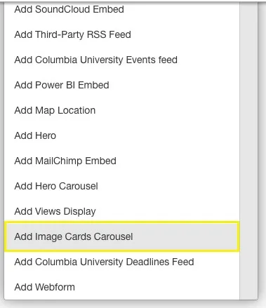
On any Landing Page select Add Image Cards Carousel from the available content options.
Configure Carousel Settings:
-
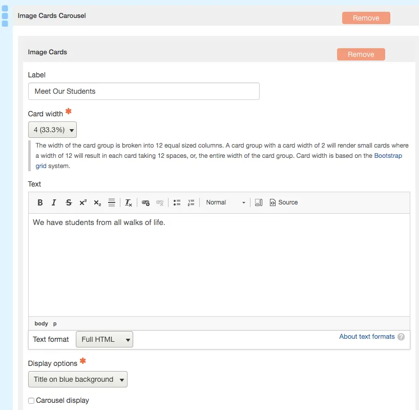
Label: Enter a title for the carousel to appear above the image cards.
-
Card Width: Set the grid width for the cards (e.g., 4 for 33.33% width). This determines how many cards are visible at once.
-
Text: Provide a brief description or introductory text to appear below the label.
Add Image Cards:
-
Click on Add Image Card to create individual cards.
-
For each card:
-
Image: Upload an image to be displayed on the card.
-
Title: Enter a title for the card.
-
Link: Provide a URL to link the card to additional content or information.
-

Save Changes
Example
- Four image cards added to the carousel
- The grid width for each card is set to 4
This means that each card will use 1/3 of the content space so three cards can show at one time. The fourth card must be rotated through the carousel to display.

Best Practices
-
Image Quality: Ensure that all images are of high quality and consistent dimensions to maintain a uniform appearance.
-
Card Content: Keep titles concise and relevant to the image to provide clear context.
-
Link Relevance: Ensure that each link directs users to relevant and valuable content to enhance user experience.
-
Accessibility: Use descriptive alt text for images to improve accessibility for users with visual impairments.