Add an icon card
Icon Cards allow you to add highlight boxes featuring an optional icon and a link.
IMPORTANT: Icon Cards can only be created for Landing Pages
NOTE: Icon Cards do not accommodate an image.
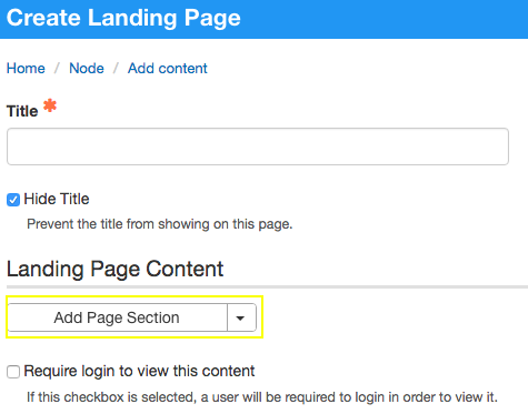
When creating a Landing Page, click Add Page Section.
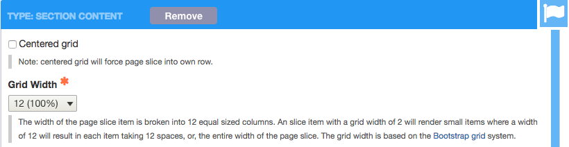
Set the grid width for the overall set of cards
Whatever you set here determines the total amount of screen width for the entire group of cards. See grid widths.
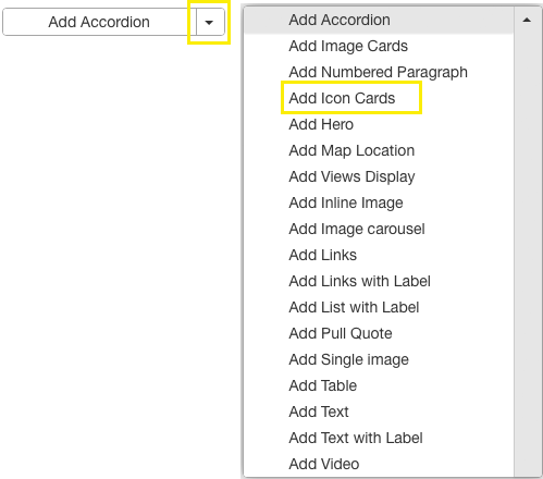
Select Add Icon Card.
Settings for the overall card group
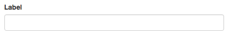
[Optional] Enter a label for the card group.
This will appear centered on the group of Icon Cards in blue large font.
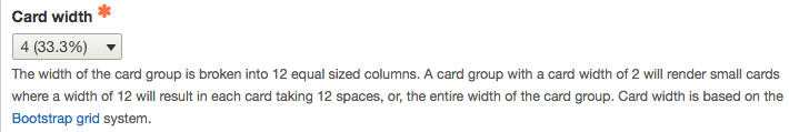
Select a Card width.
- Remember, you already selected a Grid Width for the Page Section. The Card width will be applied living within the Page Section width you specified earlier.
- The Card Width specified is applied to all cards within the Card Group
- You cannot specify different card widths within the same Card Group
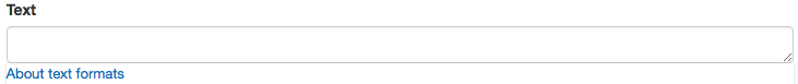
[Optional] Enter text for the card group.
- This will appear centered under the label for the group of Icon Cards.
- It will render in smaller black font.
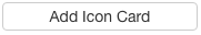
Click Add Icon Card to start entering individual cards.
Settings for individual cards
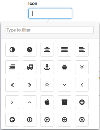
[Optional] You can add an icon to your icon card.
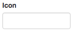
Click into the Icon box to see the available icons you can choose for your icon card.
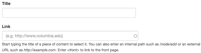
[Optional] Enter the Title for the card.
Titles appear centered on the individual card.
[Optional] Enter a link for the card.
This will create a link for the title entered.
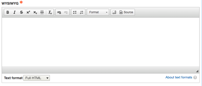
[Optional] Enter text to appear on the card.
This will appear under the title (if entered) and centered on the card.
Click Add Icon Card to add additional cards.
Creating buttons using Icon Cards

Leave the Icon field blank
Enter a title for the button
The title will be displayed centered in the button.
Enter a link for the button
When a user clicks on the button, it will direct the user to this link.
IMPORTANT: You must enter a link for the title entered above to render as a button. If you do not enter a link, you will only see text and not a button.
Leave the Text field blank