Grid Widths
Grid widths allow you to create a flexible layout for Landing pages. They must be set when:
- Creating Section Content
- Creating Image and Info cards
Section Content grid widths
The entire width of the webpage is comprised of 12 sections in total. Section Content can span the entire width of the webpage (Grid Width = 12) or a portion of the page.
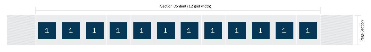
Once the Section Content grid is set, everything added to this specific Section Content will live within the selected grid size.
Example
Two Section Contents were added:
- 8 grid width
- 4 grid width
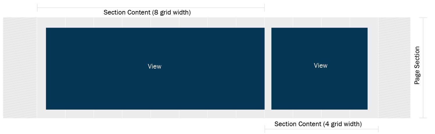
When content is added to each page section, the following layout results:
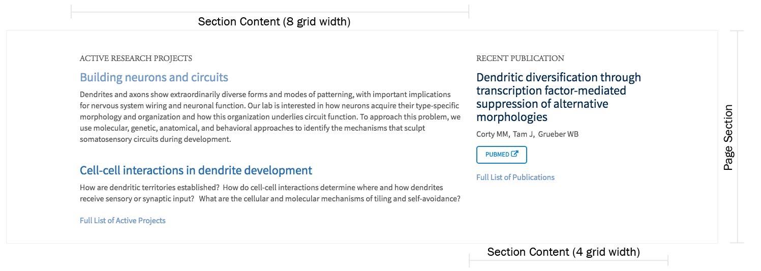
Image and Info Card grid widths
Image and Info Cards also have grid widths 1-12 assigned to them. However, they are rendered in the context of the Section Content grid size.
NOTE: Image and Info card widths apply to each card in the group.
Example 1
- Section Content: 12 grid width units applied
- Info Cards: 2 grid width units
- 6 Info Cards added
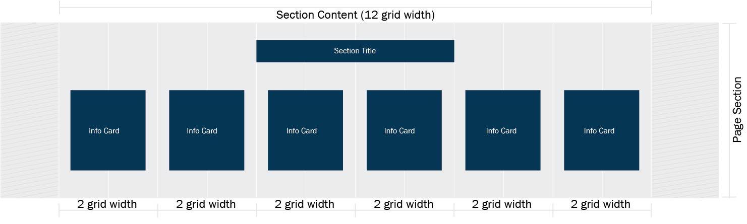
When content is added to each info card, the following layout results:
Example 2
- Section Content: 12 grid width units applied
- Info Cards: 3 grid width units
- 8 Info Cards added; only 4 fit on a single row, so the cards wrap
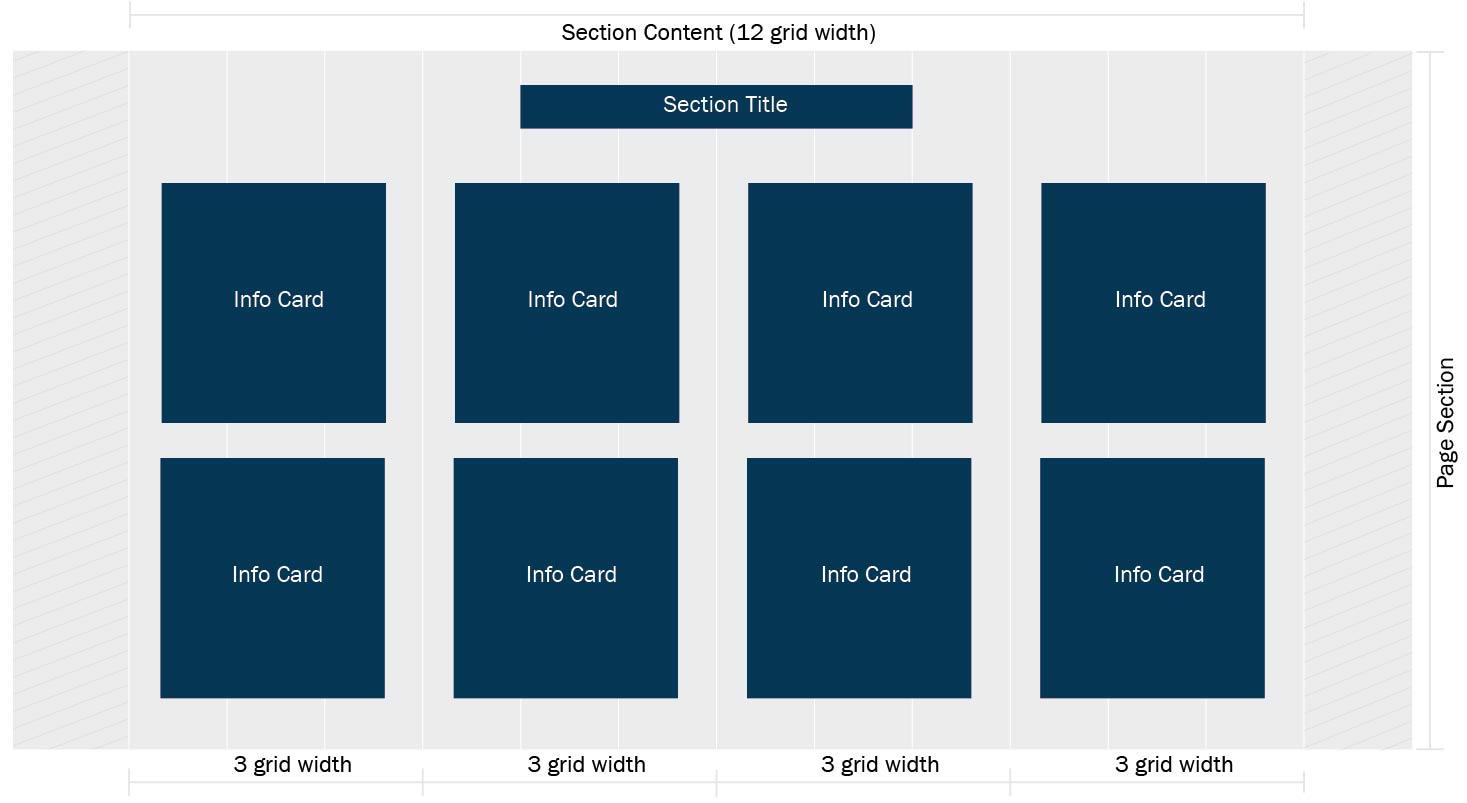
When content is added to each info card, the following layout results:
Example 3
- Section Content: 12 grid width units applied
- Image Cards: 4 grid width units
- 6 Image Cards added; only 3 fit on a single row, so the cards wrap
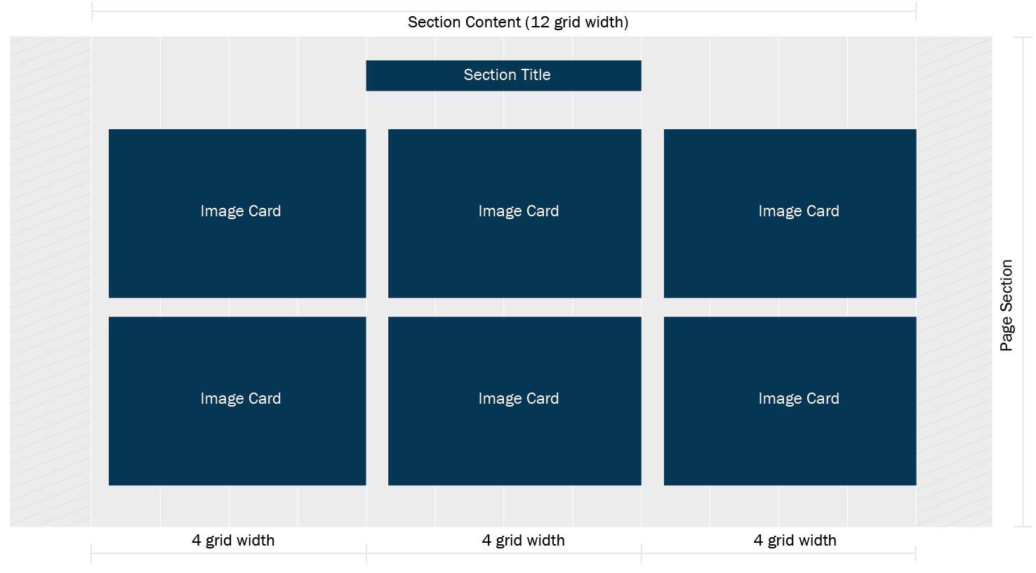
Remember, with these grid widths only 3 Image Cards will fit in a row; when 6 cards are added they will wrap.
When content is added to each image card, the following layout results:
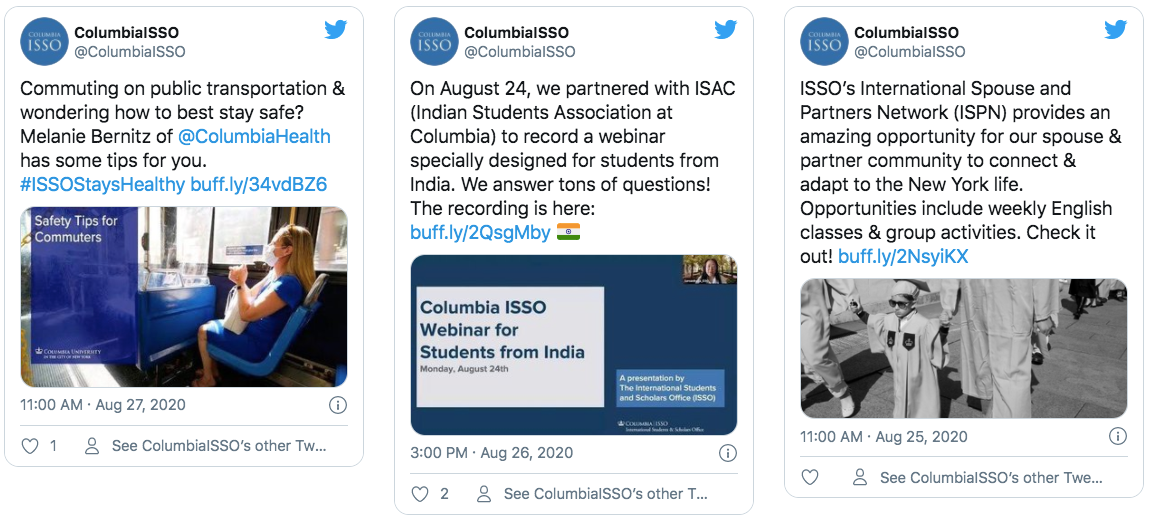
Tiling (social media embeds) horizontally across the screen
Example
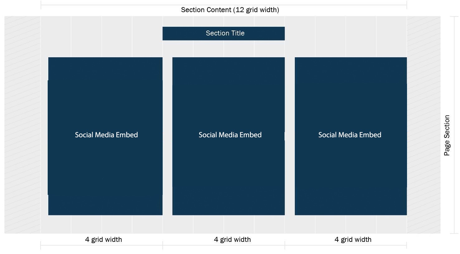
In the SAME PAGE SECTION:
- First Section Content: 4 grid widths applied
- Social Media embed
- Second Section Content: 4 grid widths applied
- Social Media embed
- Third Section Content: 4 grid widths applied
- Social Media embed
TOTAL Section Content grid widths applied: 12
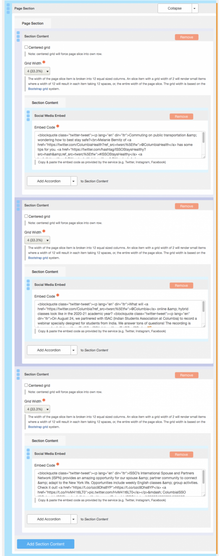
On the EDIT interface for the page, here's what the content entry looks like:
When the Social Media Embed code is added to each section content the following layout results: