Image Cards
Image Cards combine visuals with optional text and links to highlight key content.
Definition
Image Cards are visual content blocks that combine an image with optional text and a link. They are used to highlight key information or direct users to other pages. Image Cards are arranged in a grid layout and can include a group label and introductory text.
Specifications and Usage
Use Image Cards when:
-
You want to present content with strong visual appeal.
-
You need to link featured content or pages in a grid format.
-
You want to provide structured navigation or highlight services with images.
Specifications:
-
Image: Required. Appears prominently on the card. Use high-quality, consistently sized images.
-
Title: Optional. Appears centered on the card. Becomes a clickable link if a URL is provided.
-
Text: Optional. Displays beneath the title.
-
Link: Optional. Makes the title clickable.
-
Card Width: All cards in a group share the same width setting.
-
Group Label and Introductory Text: Optional. Appears above the image cards to introduce the section.
How to create Image Cards
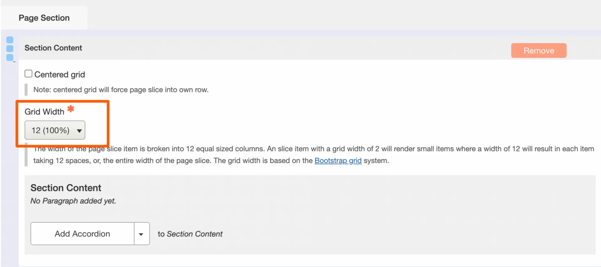
Add a Page Section
- While editing a Landing Page, click Add Page Section.
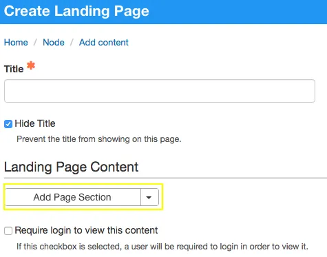
- Set the Grid Width, which defines the total width for the full set of cards.
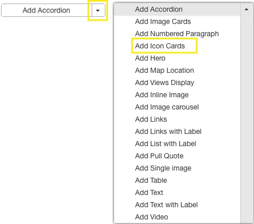
Create the Image Cards
- Click Add Image Card to insert a group of cards.
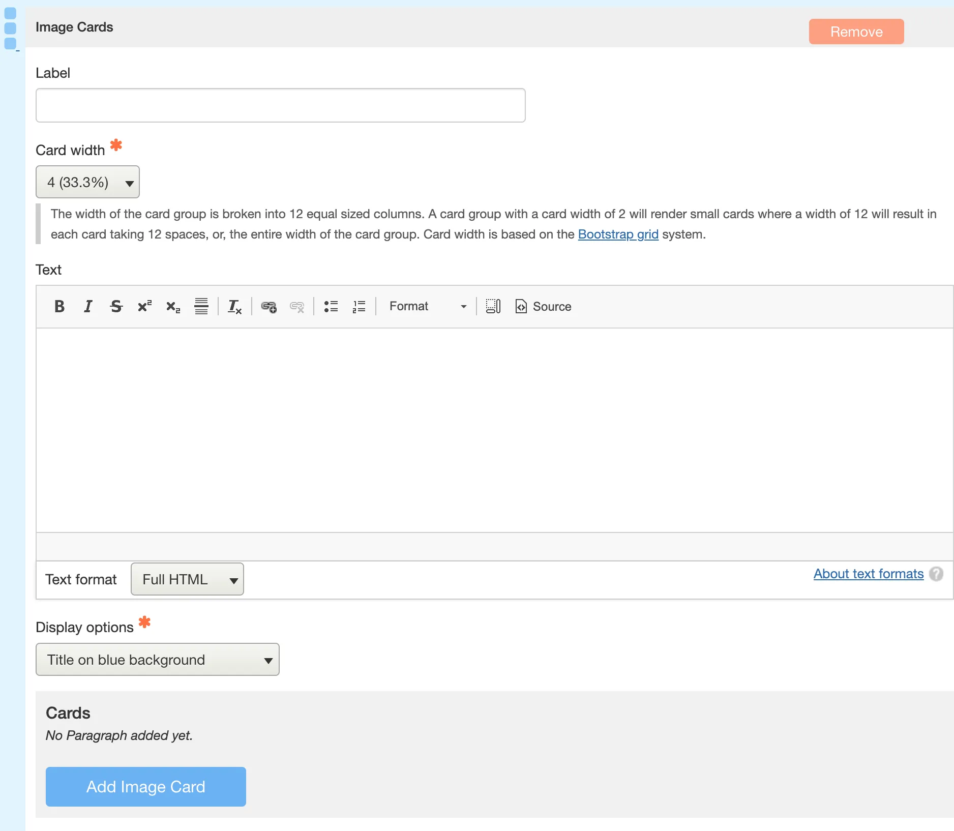
Configure the Card Group
-
[Optional] Label: Enter a label for the group of Image Cards. This appears above the cards in large blue text.
-
Card Width: Select the width for individual cards. All cards in the group will share this width.
-
[Optional] Introductory Text: Add text that appears below the label and above the cards. This provides context for the group.
-
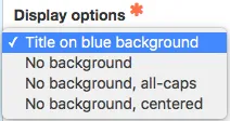
Display Options: Choose how text is displayed on the cards. This setting applies to all cards in the group.
Add and Configure Individual Card
- For each card you add:
- [Optional] Choose an Icon using the built-in icon picker.
- [Optional] Text for additional information or description beneath the title.
- [Optional] Text for additional information or description beneath the title.
- [Optional] Choose an Icon using the built-in icon picker.
Click Add Image Card to add more cards to the group.
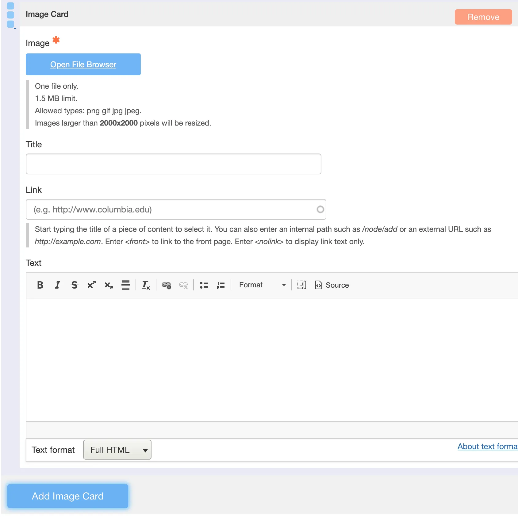
Image Guidelines
-
Use high-resolution images to avoid pixelation.
-
Maintain consistent aspect ratios across all cards.
-
Refer to the Image Specifications Quick Reference for sizing recommendations.
-
Always include descriptive ALT text to ensure accessibility compliance.