Icon Cards
Dynamic highlight boxes used to feature important links or calls to action on Landing Pages. May be used to create buttons.
Definition
Icon Cards are highlight boxes used to display important links or calls to action on Landing Pages. Each card can include an icon, a title, a link, and optional descriptive text. These cards are presented in a grid layout and are visually grouped under a shared section.
Usage & Specification
When to Use:
-
To display a row or grid of call-to-action cards.
-
To direct users to other parts of the site using stylized links.
-
To present quick, visually distinct navigation or content groupings.
Specifications:
-
A title, which appears centered at the top of each card.
-
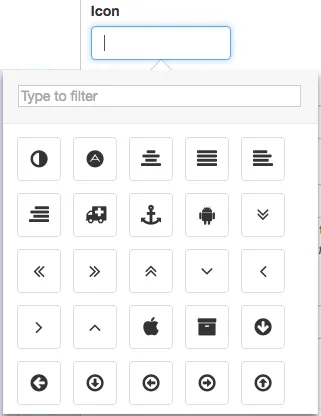
An optional icon selected from a predefined set.
-
An optional link that turns the title into a clickable element.
-
Optional text that appears beneath the title.
-
Optional section labels and introductory text that apply to the full group of cards.
-
All cards in a group share the same card width setting.
How to create Icon Cards
Add a Page Section
- While editing a Landing Page, click Add Page Section.
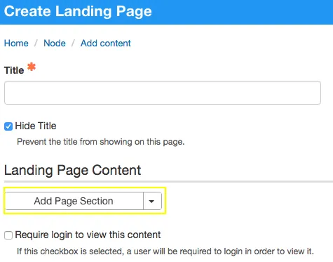
- Set the Grid Width, which defines the total width for the full set of cards.
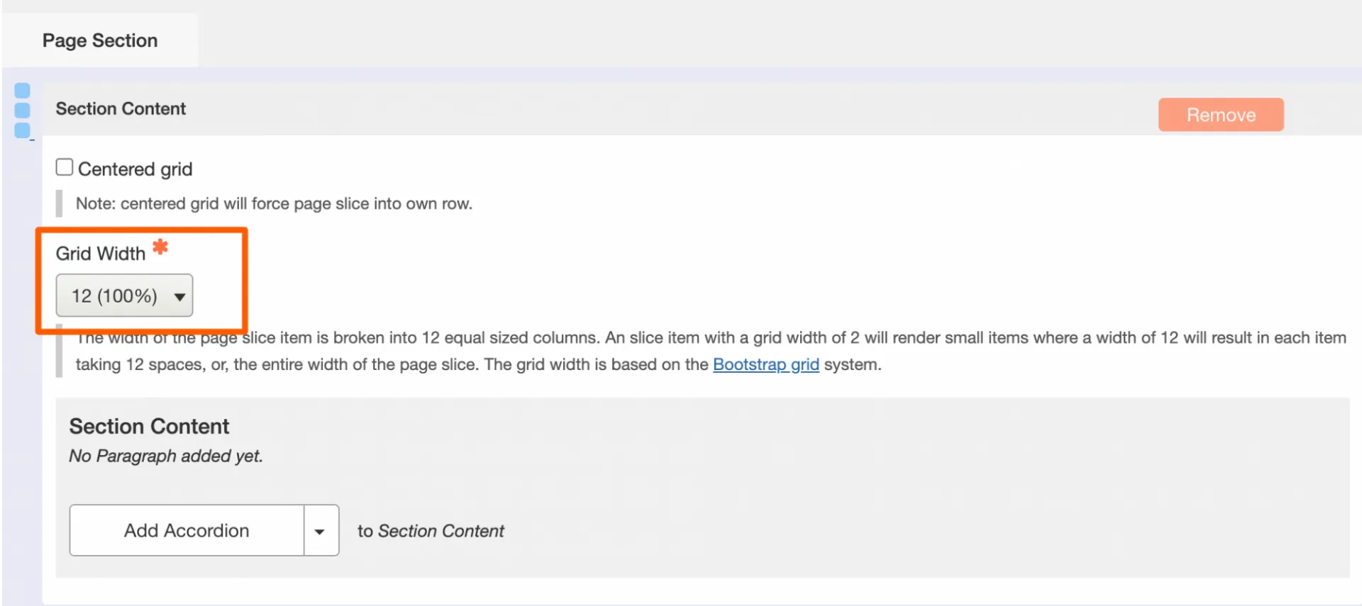
Create the Icon Card Group
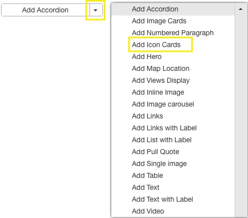
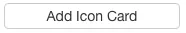
- Click Add Icon Card to insert a group of cards.
Then configure the group settings
-
[Optional] Add a Label, which appears above the cards in large blue text.
-
Select a Card Width; this applies uniformly to all cards in the group.
-
[Optional] Enter Introductory Text, which appears beneath the label.
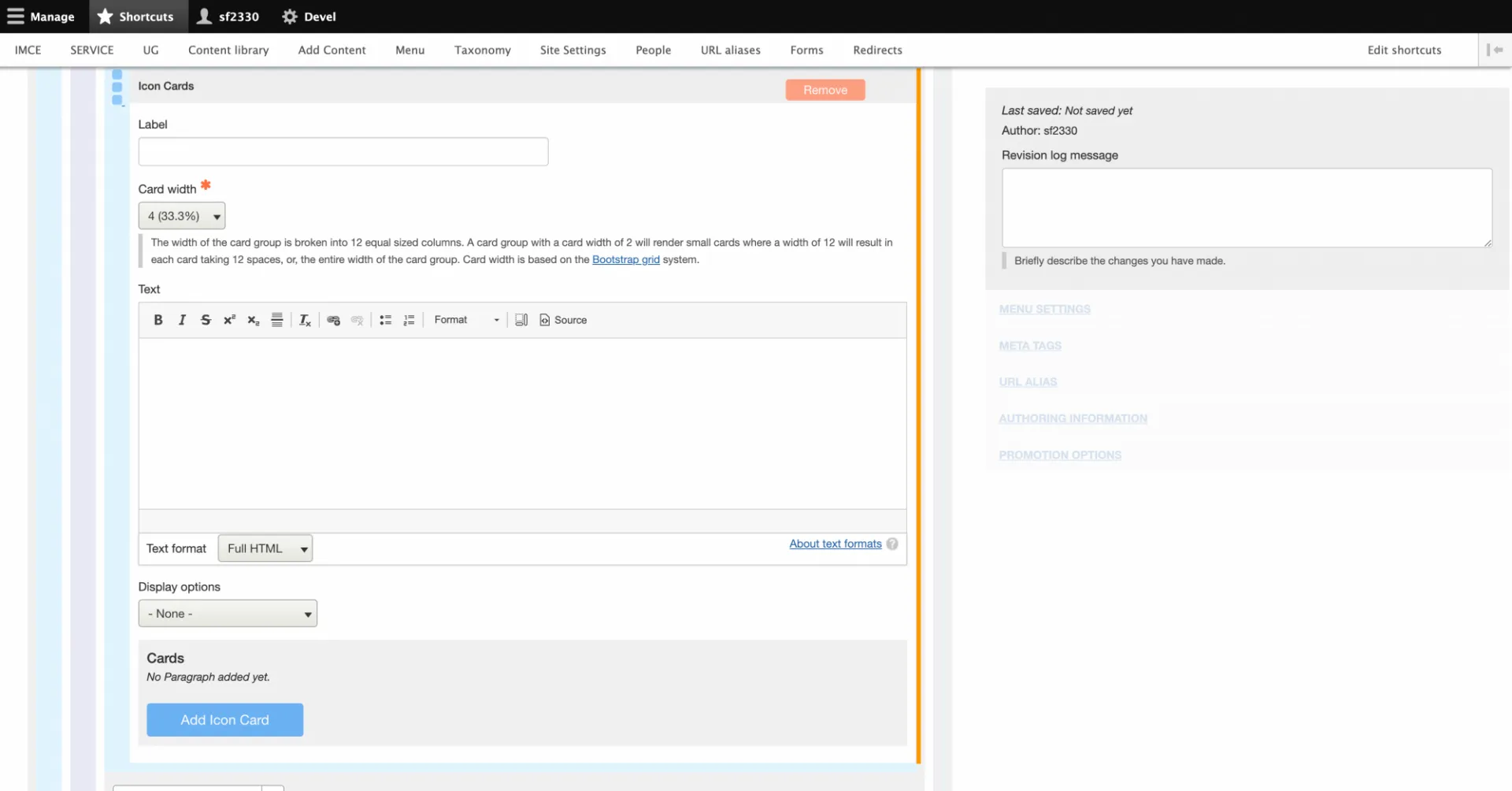
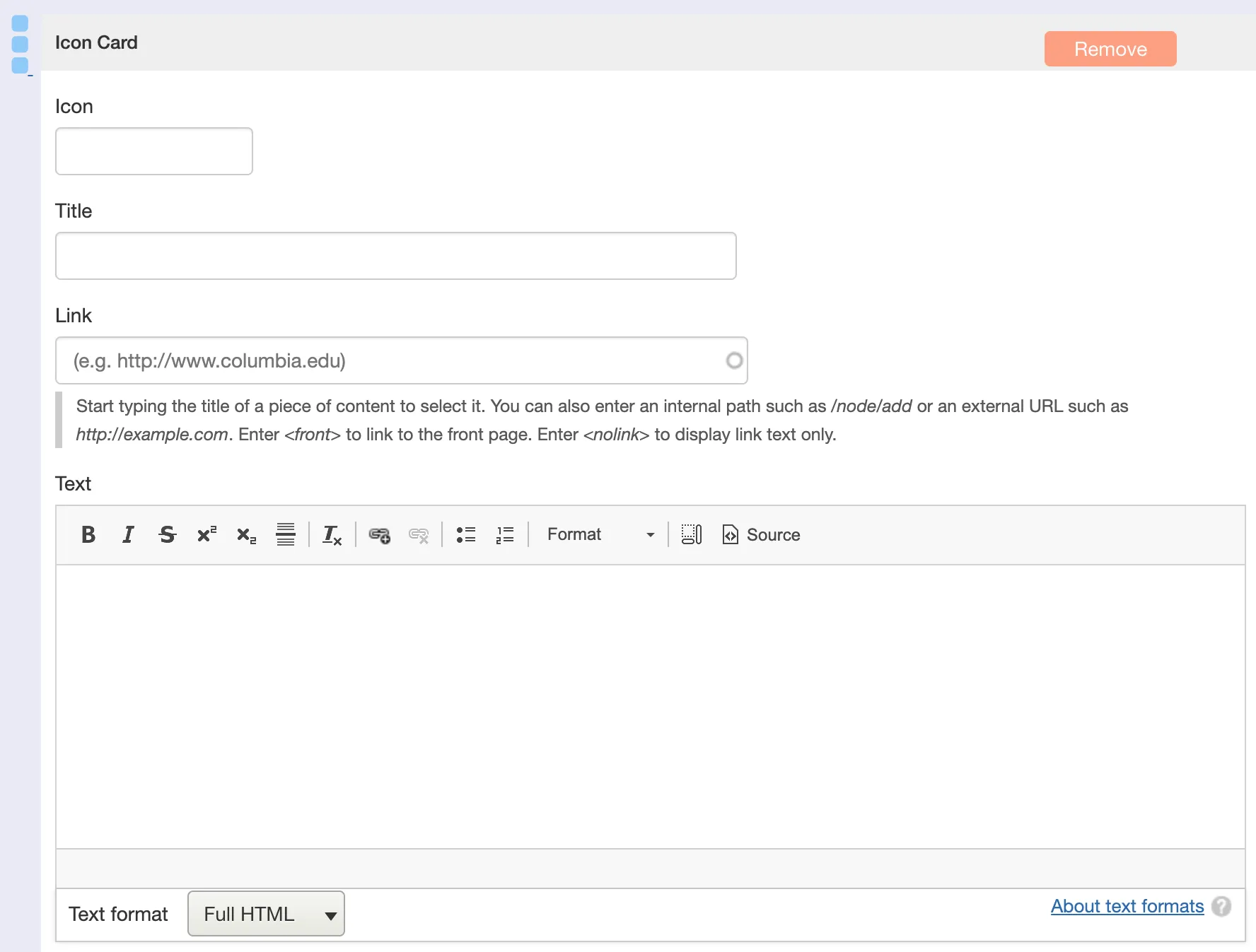
Add and Configure Individual Card
- For each card you add:
- [Optional] Choose an Icon using the built-in icon picker.
- [Optional] Text for additional information or description beneath the title.
- [Optional] Text for additional information or description beneath the title.
- [Optional] Choose an Icon using the built-in icon picker.
Creating buttons using Icon Cards

Only enter a title and a link
- Leave icon and text fields empty
- A link must be entered or just the title text will appear instead of a button