Hero
The Hero component allows you to feature a large image at the top of your Landing Page, with a title, text, and call-to-action buttons.
Definition
The Hero component in Columbia Sites allows you to feature a prominent image at the top of a Landing Page, accompanied by a title, descriptive text, and one or more call-to-action buttons. This visually engaging element is ideal for highlighting key messages or directing users to important sections of your site.
Specifications and Usage
When to Use:
-
To create a striking visual introduction on a Landing Page.
-
To emphasize important announcements, events, or calls to action.
-
To guide users toward specific content or sections within your site.
Specifications:
-
Image Dimensions: Recommended size is 456 x 1400 pixels at 72 dpi.
-
Title: Displayed in large font, centered across the top of the image.
-
Text: Appears centered below the title in a smaller font.
-
Buttons: Centered on the image; each consists of Link Text and a corresponding URL.
How to create a Hero
Create a Landing Page:
-
Navigate to your site's dashboard.
-
Click on Shortcuts > Add Content.
-
Select Landing Page from the list of content types.
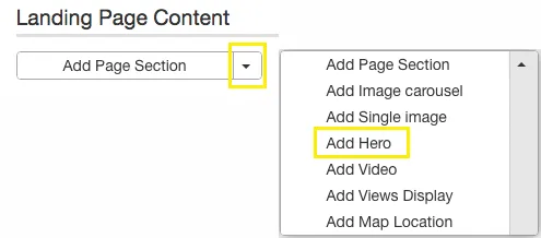
Insert the Hero Component:
-
Within the Landing Page editor, click on Add Hero from the available content options.
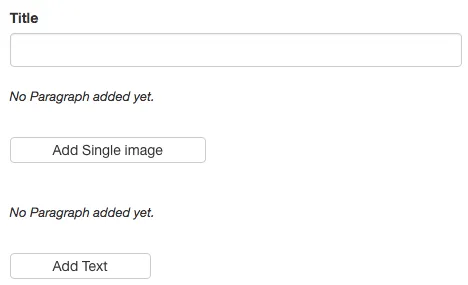
Add Title, Image, and Text:
-
Title: Enter the main heading to be displayed prominently on the image.
-
Image: Upload an image with the recommended dimensions (456 x 1400 px at 72 dpi).
-
Text: Provide a brief description or message to appear below the title.
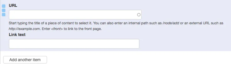
Add Buttons:
-
For each button:
-
Link Text: Enter the text to be displayed on the button.
-
URL: Provide the destination link for the button.
-
-
To add multiple buttons, click on Add Another Item. All buttons will be centered on the hero image.
Save Changes
Best Practices
-
Image Selection: Choose high-quality images that are wide and not too tall to ensure optimal display across various screen sizes.
-
Concise Text: Keep titles and descriptions brief to maintain visual appeal and readability.
-
Button Clarity: Use clear and actionable language for button text to guide user interactions effectively.
-
Accessibility: Ensure that text overlays have sufficient contrast against the background image for readability.